Choosing the right bedroom paint color can completely change how the space feels, and how well you sleep in it. Paint is one of the most cost-effective ways to renovate a bedroom, with a gallon covering roughly 350-400 square feet and costing between $30-$70 depending on quality. Unlike furniture or flooring, paint is forgiving: if you don’t like the color after living with it for a week, you can repaint without major expense. This guide walks through trending bedroom paint colors for 2026, breaks down the psychology behind color choices, and covers practical techniques like accent walls and two-tone treatments that add visual interest without overwhelming the space.
Table of Contents
ToggleKey Takeaways
- Bedroom paint color affects sleep quality and mood: cool tones like blues and greens lower heart rate and promote relaxation, while warm tones create coziness but can overstimulate if too saturated.
- Always test paint samples on actual bedroom walls in multiple lighting conditions for at least three days—colors shift significantly throughout the day and affect how your room feels.
- Cool blues and greens remain top bedroom paint colors ideas for 2026, with trending shades like pale cerulean, slate blue, sage green, and dusty periwinkle creating calming, restful spaces.
- Modern warm neutrals like greige, terracotta, and soft blush offer sophisticated alternatives to basic beige, adding depth without overwhelming the space.
- Two-tone and accent wall techniques add visual interest cost-effectively by painting just one wall or dividing walls horizontally, requiring clean taping and proper drying time between coats.
- Proper prep work—including primer on dark colors, quality paint with low VOC content, and wall sanding—ensures professional results and prevents costly repainting.
Why Choosing the Right Bedroom Paint Color Matters
Paint color affects both the perceived size of a room and the occupant’s mood. Light colors reflect more light and make small bedrooms (under 150 square feet) feel larger, while darker hues absorb light and can make spacious rooms feel more intimate.
Color temperature plays a direct role in sleep quality. Cool tones (blues, greens, soft grays) have been shown to lower heart rate and promote relaxation, making them ideal for primary bedrooms. Warm tones (terracotta, beige, soft blush) create a cozy, enveloping feel but can be overstimulating in high-saturation shades.
Finish matters as much as color. Flat or matte finishes hide wall imperfections and reduce glare, making them popular for bedrooms. Eggshell offers slight washability without shine. Satin and semi-gloss are easier to clean but highlight every ding and drywall seam, reserve those for trim and doors, not walls.
Lighting conditions change how paint reads on the wall. Always test samples in the actual bedroom, on at least two walls (one with natural light, one without), and view them at different times of day. A color that looks serene at noon can turn muddy or garish under evening lamplight.
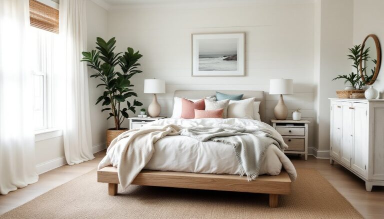
Calming Blues and Greens for Restful Sleep
Blue remains the top choice for bedrooms focused on relaxation. Soft powder blues and sky blues work well in rooms with ample natural light. For north-facing bedrooms (which receive cooler, indirect light), choose blues with a hint of gray or green to prevent the space from feeling cold.
Popular blue shades for 2026:
- Pale cerulean: A soft, slightly greenish blue that pairs well with white trim and natural wood furniture
- Slate blue: Deeper and more saturated, ideal for larger bedrooms or as an accent wall behind the headboard
- Dusty periwinkle: A muted blue-violet that adds subtle warmth without crossing into lavender territory
Green tones bring an organic, grounding feel. Sage green has been trending for the past two years and shows no signs of fading. It pairs naturally with brass fixtures, rattan furniture, and linen bedding. Deeper greens, like forest or eucalyptus, work best in rooms with high ceilings (9 feet or more) to avoid a cave-like effect.
Application tip: When using saturated blues or greens, paint the ceiling a shade or two lighter (or pure white) to maintain airiness. A monochromatic ceiling-and-wall treatment can make standard 8-foot ceilings feel lower.
Warm Neutrals That Create Cozy Retreats
Neutrals have evolved beyond builder-grade beige. Modern warm neutrals include greige (gray-beige blends), warm taupes, and earthy terracottas that add depth without strong color presence.
Greige works in nearly any lighting condition and pairs with both cool and warm accent colors. Look for versions with a slight beige or taupe undertone rather than stark gray, these feel softer and less industrial. Test samples next to your existing flooring: greige can clash with orange-toned oak or cherry but complements gray-washed or white oak beautifully.
Terracotta and clay tones are surging in 2026, especially in bedrooms with southwestern, mid-century, or eclectic decor. These colors work best in rooms with abundant natural light. In dim or north-facing bedrooms, terracotta can read as muddy brown. Pair with crisp white trim (semi-gloss for contrast) and cool-toned textiles to balance the warmth.
Soft blush and dusty rose bring warmth without going full pink. These shades work surprisingly well in adult bedrooms when kept muted. They pair naturally with dark wood furniture and black accents for a sophisticated, non-saccharine look.
Many interior design trends in 2026 lean into layered neutrals, combining two or three neutral tones in a single room for a curated, high-end feel without relying on bold color.
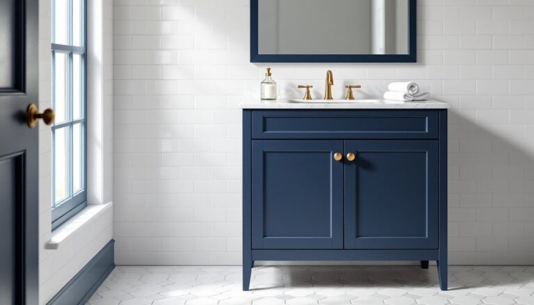
Bold and Dramatic Colors for Statement Bedrooms
Dark, saturated colors create drama and intimacy, especially in larger bedrooms or spaces used primarily in the evening. These aren’t beginner-friendly choices, they require good prep work and multiple coats for even coverage.
Charcoal and deep navy are the safest entry points into dark bedroom walls. They read as sophisticated rather than oppressive and pair well with metallic accents (brushed gold, aged brass) and rich textiles. Expect to apply at least two coats over a tinted primer for full coverage. Skipping primer will result in uneven color and visible roller marks.
Emerald green and jewel tones work in bedrooms with strong architectural features, crown molding, coffered ceilings, or picture rails. These colors demand high-quality paint: cheap versions look flat and chalky. Look for paints with a low VOC content (under 50 g/L) to avoid off-gassing odors that linger in enclosed bedrooms.
Black bedrooms are polarizing but effective when executed properly. Use a true black (not charcoal) in matte or flat finish. Balance with white or light-colored bedding, large mirrors, and adequate lighting. Black shows every surface flaw, so wall prep, sanding, filling nail holes, priming, is non-negotiable.
Safety note: When using high-hide dark colors, work in a well-ventilated space. Wear a respirator mask rated for organic vapors (not just a dust mask) and open windows even with low-VOC paints.
Two-Tone and Accent Wall Techniques
Two-tone walls and accent walls add visual interest without committing an entire room to a bold color. These techniques also help define zones in open-plan or multipurpose bedrooms.
Horizontal two-tone (chair rail or picture rail): Divide the wall horizontally, typically 32-36 inches from the floor (chair rail height) or 60-72 inches (picture rail height). Paint the lower portion a darker or more saturated color and the upper portion a lighter shade. This technique works especially well in bedrooms with low ceilings, as the lighter upper portion draws the eye upward. Use a level and painter’s tape to ensure a crisp, straight line where the two colors meet.
Vertical accent walls: Choose the wall behind the bed or the wall facing the door as your accent. For balanced visual weight, avoid painting a wall with large windows or multiple doors, these break up the color and reduce impact. When selecting an accent color, pull from existing textiles or artwork rather than introducing a completely new hue. A well-chosen wall painting technique can transform the room’s focal point without a full repaint.
Application steps for clean lines:
- Paint the entire room in the lighter base color first. Let dry completely (24 hours).
- Tape off the accent area using 14-day painter’s tape (blue or green). Press edges firmly with a putty knife to prevent bleed.
- Apply the accent color in two thin coats rather than one thick coat.
- Remove tape while the final coat is still slightly tacky (not fully dry) to avoid peeling.
Many room makeover tutorials demonstrate taping techniques for crisp edges, which is critical when working with contrasting colors.
How to Choose the Perfect Color for Your Bedroom
Start by assessing your bedroom’s orientation and natural light. South-facing rooms receive warm, direct light most of the day and can handle cooler tones without feeling sterile. North-facing rooms get indirect, cooler light and benefit from warm neutrals or soft, warm colors to avoid a washed-out appearance. East-facing bedrooms get strong morning light (which skews yellow) and benefit from colors that don’t turn garish in that light. West-facing rooms receive intense afternoon sun and can handle deeper, more saturated colors.
Sample testing is non-negotiable. Buy sample pots (typically $5-$8 for 8 oz) and paint at least two 2×2-foot squares on different walls. Live with the samples for at least three days, observing them in morning, midday, and evening light. Colors shift dramatically depending on the light source.
Consider existing fixed elements:
- Flooring: Warm-toned woods (oak, pine) pair best with warm or neutral wall colors. Cool-toned or gray flooring works with nearly any palette.
- Trim color: Bright white trim provides the most contrast and works with any wall color. Cream or off-white trim softens the look but can clash with cool grays or blues.
- Furniture: Dark furniture can disappear against dark walls, add contrast with lighter bedding and art. Light furniture works with any wall color but pops most against mid-tone to dark walls.
Professional advice: If you’re uncertain, many paint retailers (Sherwin-Williams, Benjamin Moore) offer color consultation services, some free with purchase. A quick 15-minute consult can steer you away from costly mistakes. Some paint color guides also provide curated palettes based on room type and style.
For bedrooms, stick with an LRV (Light Reflectance Value) between 40-70 for a balanced look. LRV measures how much light a color reflects on a 0-100 scale. Colors below 40 read as dark: above 70 are very light or white.
Conclusion
The right bedroom paint color sets the tone for rest and relaxation. Whether leaning into calming blues, cozy neutrals, or dramatic darks, proper prep work and sample testing make the difference between a successful project and a costly do-over. Use quality paint, invest in the right tools (good brushes, fresh roller covers, proper tape), and don’t rush the process. A well-painted bedroom can last 5-7 years before needing a refresh, so take the time to get it right the first time.