Choosing the right colour for a bedroom goes beyond aesthetics, it directly influences sleep quality, mood, and how the space functions day-to-day. Whether someone’s prepping walls for a quick weekend refresh or planning a full renovation, the colour palette sets the tone for everything else: trim selection, flooring choices, and even lighting fixtures. This guide walks through fifteen bedroom colour schemes across five distinct categories, from calming neutrals to earthy nature-inspired tones, with practical advice on application, finish selection, and coordinating elements.
Table of Contents
ToggleKey Takeaways
- Cool-toned bedroom colour ideas like blues, greens, and soft grays promote better sleep by lowering perceived room temperature and supporting melatonin production.
- Light reflectance value (LRV) determines how colours perform in your space: shades above 50 make small bedrooms feel larger, while darker shades below 30 create intimacy but require good lighting.
- Always test paint samples on large 2×2 foot swatches across different walls and times of day before committing, since lighting conditions dramatically affect how colours appear in actual rooms.
- Eggshell or satin finishes are ideal for bedrooms as they hide wall imperfections better than flat paint and resist scuffs easier, while semi-gloss works best for trim durability.
- Use a stain-blocking primer when painting over bold existing colours to prevent colour bleed-through, especially when transitioning from deep reds or blues.
- Popular bedroom colour schemes like greige, warm whites with natural wood, and sage green work across multiple design styles while maintaining a calm, restorative atmosphere.
Why Bedroom Colour Matters More Than You Think
Paint is one of the most cost-effective updates in home improvement, at roughly 400 square feet of coverage per gallon, a standard 12×14-foot bedroom typically requires two gallons for two coats. But beyond budget, colour affects physiology.
Cool tones (blues, greens, soft grays) lower perceived room temperature and promote melatonin production, which supports better sleep. Warm tones (terracotta, blush, beige) create coziness but can feel stimulating in spaces meant for rest. Light reflectance value (LRV) matters too, paints with LRV above 50 reflect more light, making small bedrooms feel larger, while darker shades (LRV below 30) add intimacy but require good artificial lighting.
Finish selection is equally critical. Eggshell or satin finishes are standard for bedrooms, they hide minor wall imperfections better than semi-gloss and are easier to clean than flat paint. Flat finishes work well on ceilings or in low-traffic adult bedrooms, but they show scuffs and are harder to touch up.
Anyone painting over bold existing colours should plan for a stain-blocking primer (oil-based or high-hide latex) to prevent bleed-through, especially over reds, deep blues, or previous wallpaper adhesive.
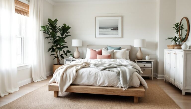
Calming Neutrals for a Timeless Retreat
Warm White with Natural Wood Accents
A warm white (LRV 85+) like Benjamin Moore’s Swiss Coffee or Sherwin-Williams’ Alabaster pairs cleanly with oak, walnut, or pine trim. This palette works in rooms with good natural light and complements both modern and traditional furniture. Keep baseboards and window casings in a slightly brighter white (Pure White or Chantilly Lace) for subtle contrast without introducing color.
Greige: The Gray-Beige Hybrid
Greige blends the coolness of gray with the warmth of beige, sitting around LRV 55-65. It’s forgiving with undertones, test samples in north-facing (cooler light) versus south-facing (warmer light) rooms, as greige can shift pink, green, or blue depending on exposure. Popular options include Agreeable Gray (Sherwin-Williams) and Revere Pewter (Benjamin Moore). Pair with crisp white trim and charcoal or navy accents.
Soft Taupe for Cozy Minimalism
Taupe tones with balanced warm and cool undertones provide depth without drama. Look for shades in the LRV 45-55 range. These work especially well in bedrooms with textured materials, linen bedding, jute rugs, matte black hardware. Avoid pairing taupe with yellow-based woods (like golden oak), which can make the room look muddy: instead, choose walnut or painted furniture.
Bold and Dramatic: Dark Colour Schemes That Work
Charcoal Gray with Brass Fixtures
Charcoal (LRV 15-25) creates a modern, hotel-like feel but requires planning. Dark walls absorb light, so incorporate multiple light sources: overhead fixtures, bedside lamps, and accent lighting. Pair charcoal with warm metallics, brushed brass cabinet pulls, gold-finish picture frames, and keep bedding in lighter tones (white, cream, light gray) to prevent the room from feeling cave-like. Use satin or eggshell finish to reflect some ambient light.
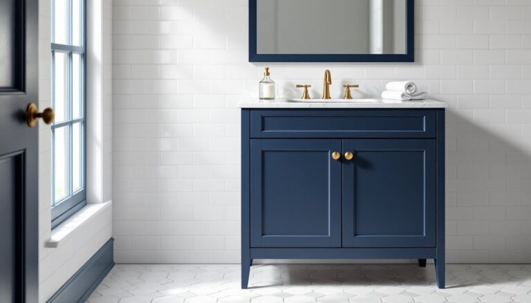
Navy Blue for Sophisticated Depth
Navy reads almost neutral in evening light and pairs well with white trim, making architectural details pop. Shades like Hale Navy (Benjamin Moore) or Naval (Sherwin-Williams) work in both contemporary and traditional settings. Navy benefits from warm-toned wood furniture (cherry, mahogany) and metallic accents. If the room lacks natural light, limit navy to one accent wall and keep the remaining three walls in a lighter complementary shade.
Forest Green with Natural Textures
Deep greens (LRV 10-20) bring richness without the starkness of black. They pair naturally with wood ceiling beams, rattan furniture, and organic bedding. Consider shades like Evergreen Fog (Sherwin-Williams’ 2022 Color of the Year) or a deeper hunter green. Balance the intensity with plenty of white, white ceiling, white or off-white trim, and light-coloured flooring. This palette works especially well in bedrooms with large windows and views of greenery.
Soft Pastels for a Soothing Sanctuary
Blush Pink with Gold Accents
Blush tones (LRV 70-80) have matured beyond nursery pink. Modern blush is muted, sophisticated, and works in adult bedrooms when balanced with structured furniture and metallic finishes. Choose shades with gray undertones rather than peachy or coral bases. Pair with white bedding, brushed gold or rose gold hardware, and charcoal or navy accents to keep it grounded. Test samples in evening light, some blush tones turn lavender under incandescent bulbs.
Powder Blue for a Coastal Calm
Soft blues (LRV 65-75) lower visual temperature and suit south- or west-facing rooms that get warm afternoon light. Think Palladian Blue (Benjamin Moore) or Sea Salt (Sherwin-Williams, which leans slightly green). Pair with white shiplap, natural fiber rugs, and linen textures. Powder blue works well in both modern farmhouse and traditional decor styles and coordinates easily with most existing furniture finishes.
Lavender for Gentle Warmth
Lavender with gray undertones avoids looking juvenile and adds subtle warmth without the stimulation of true pink or red. It pairs well with white or light gray trim and works alongside both cool and warm wood tones. Incorporate plenty of white and cream textiles to balance the colour. Lavender is one of the more design-forward choices that still reads as calming, making it suitable for primary bedrooms.
Earthy Tones to Bring Nature Indoors
Terracotta and Clay Shades
Terracotta (LRV 30-40) brings warmth and works in bedrooms with ample natural light or strong artificial lighting. These red-orange earth tones pair naturally with white oak, jute, and black iron fixtures. Since terracotta is bold, consider a single accent wall behind the bed rather than painting all four walls, or choose a lighter, diluted version of the shade for full-room application. This palette complements Southwestern, Mediterranean, and mid-century modern styles.
Warm Beige with Organic Textures
True beige, not greige, leans warmer and pairs with honey-toned woods, wicker, and natural stone. Look for shades in the LRV 50-60 range. This palette suits bedrooms with wood plank ceilings, exposed beams, or natural stone accent walls. Keep trim in a lighter beige or soft white rather than stark white, which can look too clinical against warm beige walls. Layer in linen, cotton, and wool textiles.
Sage Green for Understated Serenity
Sage (LRV 50-65) is muted enough to function almost as a neutral but brings subtle colour inspiration for calming spaces. It pairs well with white, cream, light wood, and black accents. Sage works in both modern and traditional settings and complements a wide range of existing furniture. Choose satin or eggshell finish for easy maintenance. If the room has cool north-facing light, opt for a sage with warmer (yellow-based) undertones to prevent it from reading too gray.
How to Choose the Right Colour for Your Bedroom
Start with lighting. Test paint samples on at least two walls, one that receives direct sunlight and one that doesn’t. Paint large swatches (at least 2×2 feet) and observe them at different times of day and under artificial light at night. Most paint failures come from choosing a colour under store fluorescents without testing in actual conditions.
Consider existing elements. Identify what’s staying: flooring, furniture, window treatments. Pull undertones from these fixed elements. For example, if the room has golden oak flooring, avoid cool grays or blues that will clash: instead, choose warm whites, beiges, or greiges with warm undertones.
Account for room size and ceiling height. Light colours (LRV above 60) make small rooms feel larger. Dark colours work in spacious rooms (140+ square feet) with high ceilings (9 feet or more) and good lighting. In a small bedroom, consider painting the ceiling a lighter shade than the walls to add perceived height, or use the same colour on walls and ceiling in a darker shade to create a cocooning effect.
Think about trim and finish. Most bedrooms use eggshell or satin on walls and semi-gloss on trim for contrast and durability. White trim (Pure White, Decorator’s White) provides clean contrast with any wall colour. If going for a monochromatic look, paint trim the same colour as walls but in semi-gloss finish for subtle differentiation.
Don’t skip primer. New drywall, patched areas, or significant colour changes all require primer. Tinted primer (tinted to approximate the final colour) improves coverage and reduces the number of finish coats needed, especially when going from light to dark or dark to light.
Conclusion
Bedroom colour sets the foundation for everything else, furniture arrangement, lighting choices, and even how well someone sleeps. Whether opting for timeless neutrals, dramatic darks, or nature-inspired earth tones, the key is testing samples in actual room conditions, prepping surfaces properly, and selecting finishes that balance durability with the desired look. A well-chosen palette transforms a bedroom from functional to restorative.